Selling products or services on the internet seems very difficult: you have to do SEO to get some visibility on Google, Bing, and other search engines, then you have to publish blog posts, interact with people on social media, and of course there is advertising.
However, web marketing costs are lower than traditional marketing costs, with the added value that everything can be automated with a funnel, which is the journey users make from the moment they click on your advertisements until the final purchase. If you optimise your funnel, your sales are highly likely to increase.
I will give you some ideas, with landing page examples and copy advices.
In particular, I identified five elements, often overlooked, that can determine the failure or the success of your funnel.
Copy on ads
What is the most important part of an advertisement?
Many would say it is catchy images, because a picture is worth a thousand words. The thing is you need more than that to convince someone to click on your ads, so the copy is important, too.
No strategic approach, no claim, a bland call to action: if there is no reason for a user to take action, they simply won’t. Writing something like “word’s biggest company” does not communicate your USP is valuable. Try underlining to the user what are the benefits they will get by clicking on your ad. For example, you might offer a free content or a discounted service.
Landing pages
The landing page is the first real step a user takes in your funnel, it is the page where you generate leads, and its structure should follow an accurate standard.
I said I would give you landing page examples, so allow me to play at home and let’s examine our own Popup by Wiredmark page which is, to all intents and purposes, a landing page.
In this specific case, we opted for a header that takes the whole screen space, so the attention is fully caught on the payoff and it is immediately clear who is the target of the service and what benefits they get.
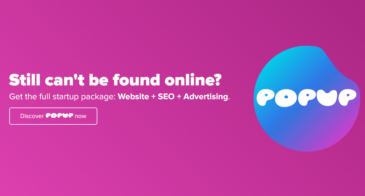
The call to action stands out thanks to the particular font we used in the button, which is the same as the logo. Those who land on this page immediately know we are promoting a service for startups and they will get an all-inclusive bundle with website, SEO, and advertising.
Let’s keep going. What do they find when they scroll down?
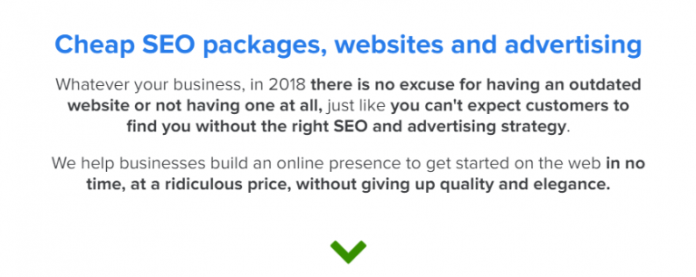
A more descriptive paragraph on the benefits they get if they choose to adhere to the program, which also triggers a sense of urgency.
This is important: it gives users a reason to either continue reading or taking immediate action.
We also keep SEO into account, placing some keywords in the content.
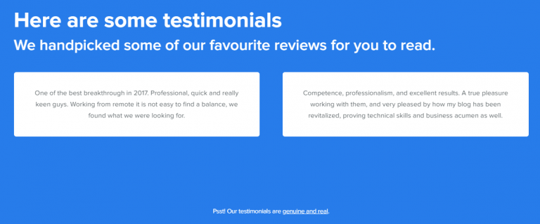
Testimonials, also called social proof, is a precious element, especially from a psychological point of view: have you ever heard the expression keeping up with the Joneses? I don’t want to bore you with the whole story, you can easily find it on Google. All you need to know is that people tend to take decisions and actions based on what others do, and they are more likely to buy things that define their social status, and that is called Jones’ effect.
In the end, the call to action:
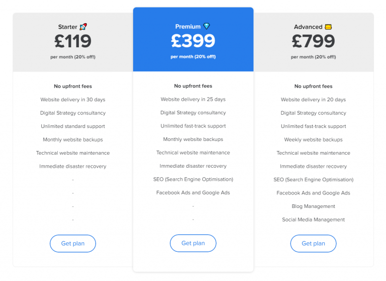
A detailed description of the benefits above the call to action is a good chance for some upselling and it is designed to trigger greed in the potential buyer: they will either want to save money or spend more to save more. Whether the case, we are achieving a goal.
Lead nurturing
No matter how you generate leads, most of them won’t be ready to buy immediately. Unless you are Amazon, people don’t trust you, so you have to build a relationship with your leads first.
Nurturing your leads, perhaps offering a freebie or starting a follow-up series, will make them ready to buy. It is essential you intercept their needs and anticipate them. Try creating a series of e-mails in which you offer a solution to their problem, for example, and they will be motivated to make the final purchase.
User experience
A UX designer will make actions on your website easier to take, by cutting useless steps from the purchase procedure or leaving just the essential input fields on a form. Pay attention to responsiveness as well, because not everyone uses a desktop or laptop PC.
Social channels and post-purchase
Taking care of your social channels by publishing fresh content regularly helps building trust: people will search for your social profiles to get support after the purchase, to get more offers, or just to stay in touch with you. None of these is a negative thing, but people may visit your Facebook page after they saw your website (by the way, make sure you monitor this with a Facebook Pixel), and you don’t want them to land on a desolate page.
Your successful funnel
At Wiredmark, funnel marketing and landing pages are two of our specialities (you can tell from the landing page examples I posted above): it is such an effective technique that a lot of businesses, from small local enterpreneurs in Birmingham to big nationwide companies are using funnels to increase their sales online.
Are you interested in being the next? Contact us and we will do our best to exceed your expectations.
